Kylie Jenner Posed In A Wheelchair On The Cover Of ‘Interview’ + We Had Some Thoughts About It
A Conversation Between Team Nylon
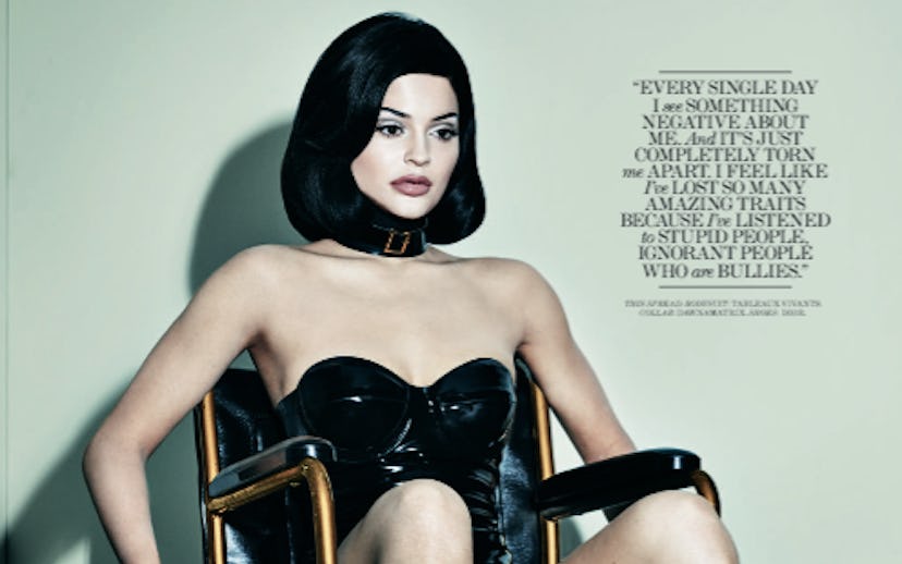
Yesterday afternoon, I was sent a preview of Interview magazine's Dec/Jan double issue, which features a pouty, wheelchair-bound Kylie Jenner in full S&M regalia on the cover. At first glance, the image is provocative, meant to occupy the same realm of Internet-breaking that Jenner's big sister Kim helped turn into the family's biggest commodity.
But after taking a moment, the images left me cold—maybe because Jenner, Interview magazine, and photographer Steven Klein's intent to provoke feels transparent, or maybe because the images themselves just aren't as subversive as those involved want us to think. Remember, wheelchairs and crutches as fashion props have been around as early as 1995, when Helmut Newton shot Nadja Auermann with orthopedic props for Vogue.
Was Kylie aware that her most high profile cover to date featured recycled fashion tropes that have been around since before she was born? And how would the Internet commentariat react when the embargo was lifted early this morning? Shock, outrage, or a collective shrug of the shoulders?
I decided to reach out to some of my colleagues at NYLON to find out their thoughts. Below, a thoughtful conversation about fame, art, and Kylie Jenner.
Me: Does anyone have a problem with this cover?
Yasmeen: I'm kind of wondering if they were going for the whole "handicapped by fame/other people's opinions of her" thing?
Hayden: The shoot reminds me of Lady Gaga's video for "Paparazzi," which was obviously a commentary on fame, obsession, and doing whatever you can to keep your name in the papers.
Leila: Yeah, but she got some serious flack for that too. The bottom line is, it's just a wheelchair, right? Are we so precious about signifiers that someone merely sitting in a wheelchair is cause for offense? Or, alternatively, are we only okay with images of wheelchairs when they are presented in a shiny, fashionable manner?
Gabe: The shininess isn't the issue. Her being normally abled in a chair is probably hurtful to some people who HAVE to use them, for whom it's not an artistic/fashion choice. That's not my big concern though. What irks me is how incredibly cynical the image is. They KNEW people would react negatively, which would be fine if there was an interesting point or statement being made here. There isn't though. Not really.
Hayden: The wheelchair, though I know it isn't, seems like an afterthought. It's her blatant aging-up and forced maturity that seems to be more striking and more designed for the headlines. This is the celebrity face we're going to be seeing for decades to come; time will pass, she'll get older (perhaps be "wheelchair/walker bound"), but will always keep that one thing that made her famous: her plump, youthful-adult face.
Ben: The symbolism doesn't really work, and as photography it isn't all that striking. If Kim's Paper cover is the gold standard, then this is just a big 'meh' and kind offensive not in its insensitivity, but because it's just lazy. No one will be talking about it in two days.
Hayden: Let's consider the source. It's Interview Magazine, a publication conceived by Andy Warhol. If he were alive today, she would definitely be one of his "muses." He'd exploit her glamour, exaggerate her plasticity, and, yes, make the obvious association to crippling fame. It's easily reproducible and, as Gabe said, cynical.
Yasmeen: The male model is clearly supposed to represent Warhol.
Gabe: This is imagery we've seen before in French Vogue, Gaga videos, Steven Klein's previous projects, and elsewhere to good effect. Here though, the whole point is to piss people off and to draw attention, and it all comes at the cost of potentially hurting the feelings of people who've already been given a tough row to hoe. This was custom designed for headlines which would be fine if it wasn't also designed to aggravate people who've done nothing but get stuck in a wheelchair.
Hayden: Is it the most groundbreaking cover and shoot, ever? Hardly. It's so blatantly Steven Klein and the robotic/otherworldly woman trope is a bored archetype. (I only know Klein on a surface level, but this seems to be a trend of his.) But it plays into the banality the Kardashian-Jenners have, arguably, made into an art form.
Gabe: I agree with your interpretation of the image as a thing in and of itself and perhaps as a moment as well. As a cover though, you have to look at it as a different kind of decision. Personally, I'd have less of an issue, or maybe no issue, if this were in-book as opposed to on-cover. Also, I'd be fine with it if it were innovative in any way (I swear I've seen exactly this image before). The image doesn't offend but the decision to put it on the cover...
Hayden: I'm not saying it's good, but it's provocative in the most basic and guilty pleasure-like way possible.
Gabe: It's punching down. It's bush league. I'm disappointed.