Last week, the internet completely lost it when IHOP, everyone’s favorite 3am pancake house, announced it was rebranding and changing its name to “IHOb.”
After a series of teaser tweets over the weekend, earlier today it was revealed that the uppercase “P” being flipped to a lowercase “b” is meant to stand for burgers—as the chain restaurant is adding a handful of them to its menu. It’s also been confirmed that this is, in fact, just a marketing ploy.
Well, the internet still just isn’t having it and, as would be expected, drama ensued. From references to gang culture to an alleged (though, we assume, all in good fun) feud with Wendy’s, people just can’t quite get behind IHOb, even if the rebranding isn’t for real.
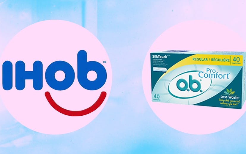
But perhaps the most perplexing of all is just how much this “new” logo resembles the logo for o.b., the tampon brand—which all of Twitter happily called out.
I mean, remove the “I” and the “H” from “IHOb” and the periods (pun intended) from o.b., and, well, you have the exact same logo. Who was on your rebranding (or, as it was put in a company press release, “re-burgering”) team, you guys? And considering that signs are already up in IHOP (err, IHOb) locations, do we smell a legal battle coming?
