Fashion
Riccardo Tisci Unveils New Burberry Logo And It’s Drawing An Unexpected Comparison
Are we the only ones who see this?
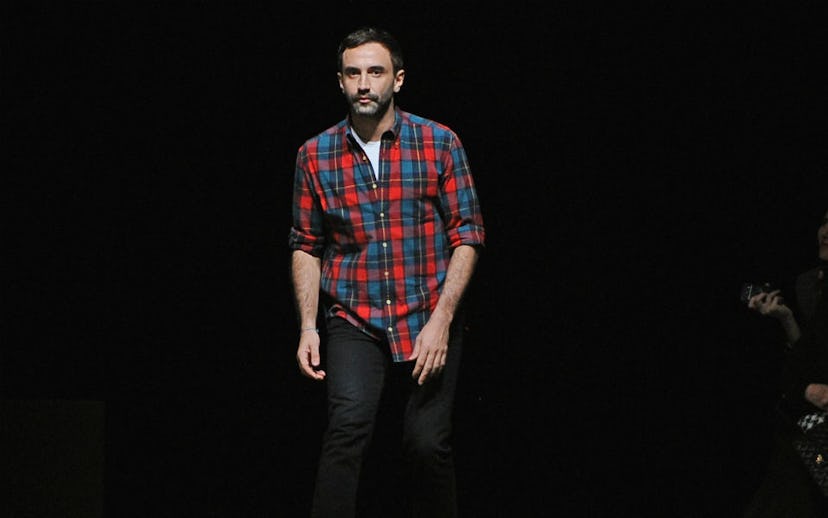
A new era is being ushered in for Burberry. This past spring, it was announced that Givenchy head Riccardo Tisci would be moving over to head one of Britain’s longest-running fashion houses. And this morning, both Tisci and the brand unveiled the company's new, modernized logo and monogram on Instagram.
The graphics were designed in collaboration with British art director and graphic designer Peter Saville, who previously re-designed the Calvin Klein logo with Raf Simons. The new Burberry logo is sleek and simple, while the monogram is more elaborate, and made up of interwoven Ts and Bs, which looks like the Boston Red Sox “B,” but maybe that’s just us? The two letters are an homage to the brand's founder, Thomas Burberry, and their use was inspired by Tisci’s visit to the house’s archive. According to email exchanges shared to the Burberry Instagram, Saville created the new design in only four weeks—a pretty swift timeline.
According to Business of Fashion, this is the first time the brand has changed its logo in almost 20 years. The reveal comes ahead of Tisci’s first runway show for Burberry, taking place during London Fashion Week in September. We’re excited to see what other changes he has up his sleeve.