Life
Pantone Color Of The Year Represents "Need For Optimism"
It was chosen "in reaction to the onslaught of digital technology and social media"
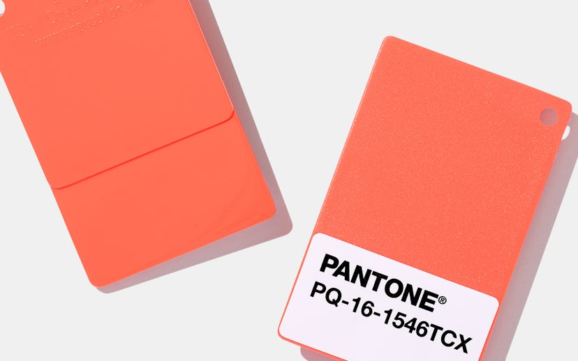
Pantone has revealed its 2019 Color of the Year, and the explanation is a Big Mood. PANTONE 16-1546 Living Coral is a vibrant orangey-pink hue, which the company claims "embraces us with warmth and nourishment to provide comfort and buoyancy in our continually shifting environment."
Along with a visual of a little fish swimming through the coral, Pantone explains that the color was chosen "in reaction to the onslaught of digital technology and social media increasingly embedding into daily life," later adding that it symbolizes "our innate need for optimism and joyful pursuits." If there's anything 2018 desperately needed, it was a lot more optimism and joy.
The executive director of the Pantone Color Institute, Leatrice Eiseman, explains the color choice further, "With consumers craving human interaction and social connection, the humanizing and heartening qualities displayed by the convivial Pantone Living Coral hit a responsive chord."
The 2018 Color of the Year was equally as uplifting, with Ultra Violet described as taking "two shades that are seemingly diametrically opposed—blue and red—and brings them together to create something new," a unifying concept that is still desperately needed in the world around us.