Fashion
Zara's New Logo Is Leaving Some People "Stressed Out"
"It makes me feel cramped"
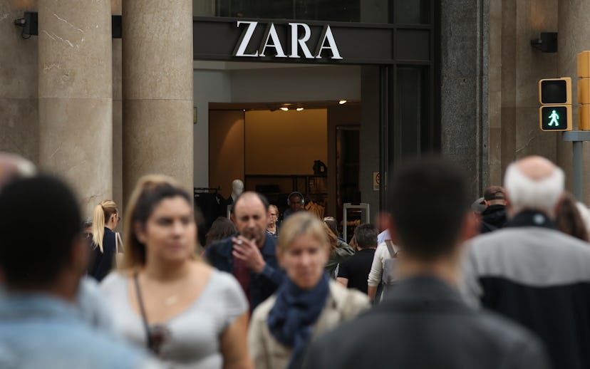
New year, new look! Zara has revealed a brand-new logo that's left some people feeling claustrophobic.
The previously spread-out letters are now close-knit and overlapping. The Z bleeds into the A and the curves of the R cross into the final A's territory. According to Hypebeast, the logo was created by French editor and artistic director Fabien Baron, who first used similar topography for Harper's Bazaar in the '90s.
This is only the second time the brand has switched things up in its 45-year history, and it might be the last given people's reactions.
Some predicted what the rebranding would look like in another eight years.
While others brought up the highly debated Slack logo change.
Then there were those who compared the logo to the brand's small clothing sizes.
Regardless of opinions, as Fast Company points out, this could be the future of branding as we know it. So, might as well get used to it.
